- Posted by: atagkas
- Published: 21-07-2015
- Category: Application updates
QR-Patrol new web interface!
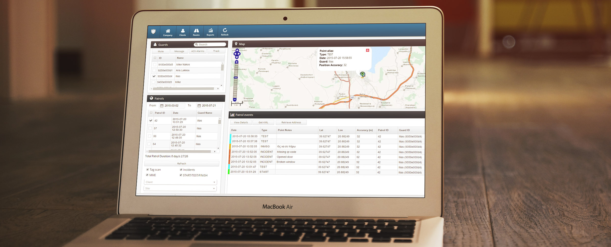
We’re delighted to announce the launch of a major update to our web application software – a brand new interface and major graphic design improvements!
That’s time to change and upgrade! And yes, that’s time to change look! QR-Patrol runs from now and on via a redesigned web interface with new color combinations and smooth graphic improvements in grid, dialogs, fonts and buttons!
The old black sidebar interface is gone and a completely new one is now in its place. It bears a brand new and well-designed appearance as well as some trivial changes to functionality. Some of its most notable changes are as follows:
- - New Navigation bar with icons
- - Brand new dialog boxes with nice shadow effects
- - Brand new rounded buttons
- - New application grid with distinct grey and white color combinations
Over the last two years, we’ve built a guard tour system that has helped security firms increase their productivity level, customer satisfaction and their professional reputation.
Here at QR-Patrol, we’ve been working hard over the past few months on a major update to our web application – the software our customers and partners use to manage their guards and territories.
Listening to our customers’ feedback and requests and feeling the need to upgrade the graphic interface of QR-Patrol web application, we have produced a more intuitive and nice designed web app, incorporating all features and improvements stated above.
If you have any feedback for the new web-app please feel free to contact us.

